When you click on links to various merchants on this site and make a purchase, this can result in this site earning a commission. Affiliate programs and affiliations include, but are not limited to, the eBay Partner Network.
Antique Peacock Broom Label 🦚 1910s–1920s NOS Advertising Art, Bird Wall Decor
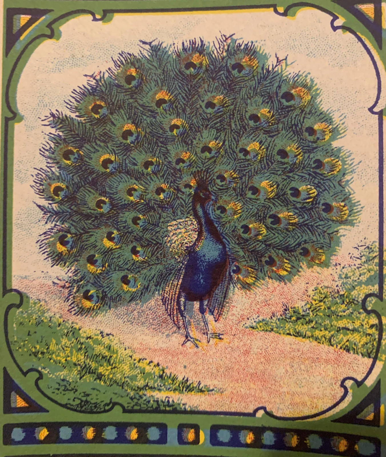
Antique Vintage Peacock Broom Label 1910s–1920s 6" x 3.5" ~ New Old Stock, unused and crisp from old inventory stock.
🦚 There is a moment, holding a piece of commercial lithography from a century ago, when you stop thinking about it as a label and start thinking about it as a painting. That is exactly the experience this antique peacock broom label delivers. Six inches tall and three and a half inches wide — substantial enough to command a wall, vivid enough to stop a conversation — this is American commercial art from the peak of the broom label era, printed when the lithographers behind these designs were the most skilled working artists that household goods manufacturers could afford to hire. And they were very, very good.
The peacock at the center of this label is displayed in full courtship fan — tail feathers spread wide into a near-perfect circle that fills nearly the entire image field. The feathers are rendered in deep greens and teals, each one individually articulated, the distinctive eye-spots picked out in gold and dark centers that catch the light even a century after printing. The bird's body is a deep iridescent blue, the neck and breast catching the lithographer's light in a way that took genuine skill to render in flat ink on flat paper. The crest rises from the head in a delicate spray of filaments. The whole bird stands on sandy ground with low green grass on either side, a pale sky behind it, and the full display framed within an ornamental cartouche of green Art Nouveau scrollwork with decorative corner details that anchor the design at all four points. Running along the bottom, a band of circular decorative elements — alternating blue and gold — adds a final horizontal anchor to the composition. The outer border is a warm field that sets the central image apart from the world. This is a complete, confident, beautifully resolved piece of commercial illustration.
🖨️ The printing technique here is chromolithography — the same process that gave the late Victorian and early Edwardian eras their distinctive visual richness. Multiple passes through a lithographic press, each pass laying down a different color, the plates hand-drawn and hand-corrected by craftsmen who understood color separation before any machine could do it for them. When it worked — and on a label like this, it clearly worked — the result was full-color image reproduction with a warmth and depth that modern digital printing still struggles to exactly replicate. The colors in this label are not faded approximations of what they once were. They are what they always were: rich, saturated, and alive.
The label is New Old Stock (NOS) — printed and preserved as inventory, never applied to a broom handle, never subjected to shelf wear or the handling of a retail environment. The surface carries no adhesive damage, no fold lines from a broom stem wrapping around it, none of the humidity and grime that a working label would have accumulated. What you are looking at is the label exactly as it left the print shop — as fresh in its colors and as sharp in its detail as the day it came off the press.
🏭 To understand what this label is, you have to understand what broom labels were for. By the early 1900s, broom manufacturing had become a serious American industry, concentrated in clusters of small regional firms — Pennsylvania, Illinois, the Midwest — that competed fiercely for shelf space in hardware stores, general merchandise retailers, and the growing catalog market. Every manufacturer produced a functionally similar product. A broom was a broom. What differentiated one from another on a crowded shelf was the label on the handle, and in that environment, the label was everything. It was the brand identity, the advertising budget, the product promise, and the quality signal all rolled into a piece of paper roughly the size of a playing card. Companies that could afford a beautiful label hired the best lithographers available. Companies that could not afford a beautiful label lost.
The peacock was not an accidental choice for a broom label motif. 🦚 In the design language of the Art Nouveau and Arts and Crafts movements that dominated commercial illustration in the 1910s and 1920s, the peacock carried a specific set of associations: beauty, luxury, the aspirational domestic sphere that a well-run household represented. A woman reaching for a broom on a shelf lined with ten competitors was reaching for something she would look at every time she swept her kitchen floor. The peacock said: this one is different. This one is the quality choice. The exotic bird imagery had an additional appeal in American regional markets — the tropics, the far world, the romance of places most housewives would never visit, rendered in gorgeous color and available for the price of a household broom.
The story passed down among broom label collectors holds that most of the artists who produced these designs were formally trained commercial illustrators — men who had come up through the lithography trade at a time when lithographic printing was the dominant visual medium in American commerce, before halftone photography began displacing hand-drawn illustration in the 1920s and 1930s. The lore runs that these artists received little recognition and modest pay for work that was, by any honest measure, equal in technical skill to what their counterparts in magazine and poster illustration were producing. Their names were not printed on the labels. Their designs outlasted most of the companies that commissioned them. And the labels they produced — the ones that survived in old stock rather than being glued to broom handles and thrown away — are now among the most vivid small-format examples of American commercial lithography that a collector can actually find and hold.
🏚️ The documented history of American broom manufacturing includes names like Hamburg Broom Works of Hamburg, Pennsylvania, established in 1894 by Wilson Schmick, which remained in operation long enough to become a matter of public record in 1923. Windsor Broom Co., also out of Hamburg, operated during the same general window. These were not multinational corporations. They were often family operations in small industrial towns, where broom-making was the town's reason for existing — where the workers who swept the floors of America's kitchens were also the neighbors of the men who ran the machinery that made the brooms. The label was the face of that entire small-town enterprise, the one piece of graphic design the company owned, and they put serious money into making it beautiful.
No specific Peacock brand has been traced to a named firm in the surviving trade directories — that documentation, if it ever existed, did not make it into the surviving record. What is documented is the broader tradition this label belongs to: the regional American broom label industry, the lithographic printing firms that served it, and the specific design era — Art Nouveau into early Art Deco, roughly 1910 through the mid-1920s — when exotic bird imagery was at its peak in commercial illustration. The peacock motif, the ornamental scrollwork cartouche, the color palette, and the technical execution all place this label squarely in that window.
🖼️ The framing argument for this label is simple. At 6 x 3.5 inches, it fits a standard small frame or drops naturally into a mat alongside companion pieces. The vertical orientation and the near-circular composition of the peacock display make it work as a standalone piece — it does not need context to read as complete. The greens, golds, and blues in the feathers, the darker decorative border, the pale ground of the image field — this is a palette that coordinates with both warm-toned interiors and cooler, more neutral spaces. It holds its own against a white wall. It comes alive against a dark background, where the iridescent teals and golds of the feathers push forward into the room.
A shadow box frame with a deep mat would give the label the presentation it was always capable of but never received — these were working labels, not gallery pieces, and the only reason this one survived in this condition is because it never got used. That oversight is now a collector's opportunity.
✨ Collectors who have built focused collections around bird-themed broom labels — peacocks, macaws, parrots, eagles, all the exotic and patriotic imagery that populated American broom label art from the 1900s through the 1930s — report that this category has become genuinely difficult to source in NOS condition. The labels that went onto actual brooms are gone. The labels that survived in old stock, the printer's inventory, the manufacturer's warehouse shelf, the estate sale box — those are the ones that come to market, and they come in numbers that reflect how little of that original stock made it through a century of clearouts, floods, fires, and the general indifference of people who did not yet know what they were looking at.
The lore in the collector community holds that once this material finds its way into collections and framed wall displays, it stops circulating. It gets hung. It gets kept. Museum collections and art institutes that have begun acquiring American commercial lithography ephemera — broom labels among them — are not selling what they buy. The supply is what it is, and what it is, is finite.
🎁 This label belongs with the advertising art collector who frames what they find and builds a wall that tells the story of American commercial illustration before photography took over. It belongs with the bird art enthusiast who wants something genuinely old — not a reproduction peacock print from a gift shop, but a century-old piece of working American art that happens to be a peacock. It belongs with the Art Nouveau and Arts and Crafts collector who traces that movement through every medium it touched, including the labels on household goods. It belongs with the Americana collector who understands that the everyday commercial objects of ordinary domestic life are primary sources — that a broom label from 1915 tells you as much about that moment in American life as any formal document.
🦚 The peacock on this label spent a century waiting to be framed. The lithographer who drew it — skilled, underpaid, unrecognized, and genuinely talented — spent their working life producing commercial art that was used and thrown away. This one survived. That is the whole story, and it is enough.
Antique Vintage Peacock Broom Label 🦚 1910s–1920s ~ 6" x 3.5" ~ New Old Stock ~ Chromolithograph ~ American Broom Label Advertising Art ~ Bird Wall Decor


 ABOUT
ABOUT